Resources · Guide 05 · SITE
Turn a marker wireframe into a working mobile web page
Sketch your page in boxes and squiggles, photograph it, and Claude builds it as a real, working web page: hero, pricing, reviews and footer, then the whole page that scrolls. It is one HTML file you can open on your phone, change and publish. This is how the ceramics page in the reel was made.
What you'll make
- A working, mobile-first web page in a single HTML file
- A hero, a pricing section with a monthly/yearly switch, a reviews section and a dark footer with an email field
- A consistent palette and type scale you can change in one place
- A desktop layout as well, so it does not look like a stretched phone screen
What you need
Claude
Reads your wireframe and writes the page (as an artifact in claude.ai, or as files in Claude Code)
A marker and paper
Wireframe it one phone screen at a time
A static host (optional)
Netlify Drop, GitHub Pages or Cloudflare Pages put a single HTML file online
Step by step
6 steps-
Wireframe it in boxes
Draw a tall phone-shaped rectangle per section. Use the usual shorthand: a box with an X for a picture, thick lines for a headline, thin lines for text, a rounded box with a word in it for a button. Shade the thing you want to stand out, like the popular price tier or a dark footer.
Write one note under each section saying what it is for. In the reel the notes were "hero", "3 tiers, middle = popular", "3 quotes w/ stars" and "dark footer + email". Photograph each sheet straight on.
-
Give Claude the wireframe and the facts
Claude can design the page, but it can't know your prices or what you sell. Put the facts in the message: the brand name, what you do, who it is for, your prices, and whether you have a photo for the top of the page.
Ask it to read the wireframe back to you first. That catches misreads before any code is written.
Ask ClaudeHere is a photo of my website wireframe. Build it as a working mobile-first web page in a single HTML file (inline CSS and JavaScript, Google Fonts are fine). Brand: [NAME]. What we do: [ONE LINE]. For: [AUDIENCE]. Prices: [PRICES]. First, list the sections you see from top to bottom and what each contains, and ask me anything the sketch doesn't tell you. Then build the first section only and show it as an artifact.
-
Lock the look before the rest
Once the first section looks right, ask Claude to write down the palette, fonts and sizes it used and stick to them. That is what makes four separate sections look like one site.
The reel used one heading font (Bricolage Grotesque), one text font (Inter), a cream background, a dark brown for text and buttons, and a single clay accent.
Ask ClaudeBefore the next section, write the design system you used as CSS variables at the top of the file: background, text colour, one accent, an alternate section background, a dark footer colour, the two fonts, the heading and body sizes, the corner radius and the shadow. Use only these from now on.
-
Build the rest section by section
Ask for one section at a time and check each on your phone. Point out what doesn't match your sketch rather than describing a new design.
Ask for the small interactions your sketch implies: the monthly/yearly switch that changes the prices, an email field that confirms when you press Subscribe, a menu that opens.
Ask ClaudeNow build the pricing section from my wireframe: a monthly/yearly switch, three tiers with the middle one dark and marked POPULAR, ticks for each feature and the price large on the right. Make the prices change when I flip the switch. Then do the reviews and the footer the same way.
-
Put it together and check it on a real phone
Ask for the full page with all sections in order, plus a desktop layout so it doesn't look like a stretched phone screen on a laptop. Then open it on your phone and scroll the whole thing.
Check three things yourself: nothing scrolls sideways, the text is easy to read without zooming, and every button is easy to tap.
Ask ClaudePut all sections together as one page. Add a desktop layout above 960 px wide (hero image beside the text, pricing and reviews in three columns). Then check it: no sideways scrolling at 375 px, body text at least 16 px, buttons at least 44 px tall, headings in the right order, alt text on images, and animations turned off for people who prefer reduced motion.
-
Make it real before it goes live
Swap the placeholder picture for your own photo. The image in the reel was generated separately; Claude builds the page, not the photography.
Replace any invented reviews or numbers with real ones, and connect the email field to your newsletter service: on its own it only shows a thank-you message. Then drag the file into a static host such as Netlify Drop to put it online.
The prompts behind the reel
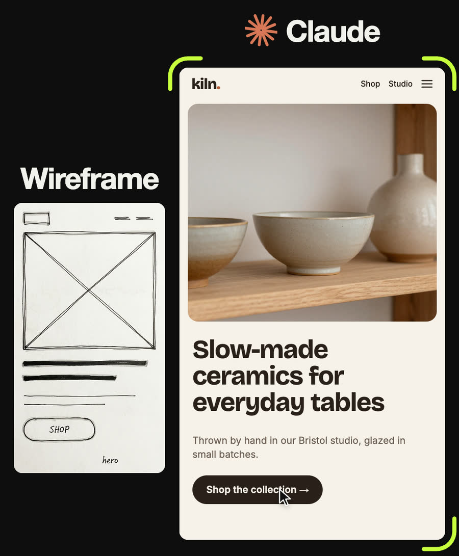
From my wireframe's top section: nav with the logo "kiln." (full stop in the accent) and Shop / Studio links plus a menu icon; a big rounded image card inset from the edges; a three-line headline "Slow-made ceramics for everyday tables" that appears word by word; a short grey subline "Thrown by hand in our Bristol studio, glazed in small batches."; one dark pill button "Shop the collection →". Cream background #f6f1ea, dark brown text #2a201a, clay accent #b5603a.
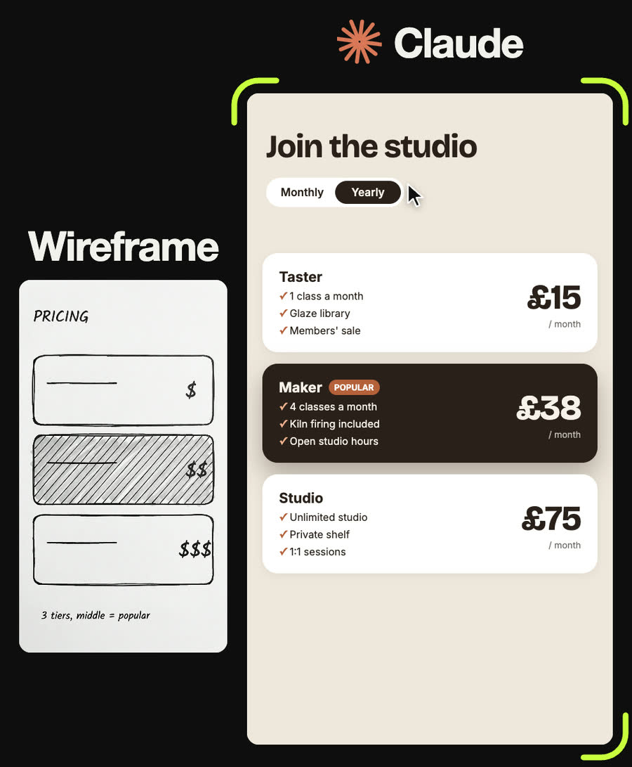
Pricing section on a sand background #efe7dc: headline "Join the studio", a Monthly/Yearly switch with a dark sliding pill, then three stacked cards: Taster £18 (£15 yearly), Maker £45 (£38 yearly), Studio £90 (£75 yearly). The middle card is dark with a clay POPULAR chip and a deeper shadow. Three features each with a clay tick. Prices large on the right and they count to the new value when the switch changes.
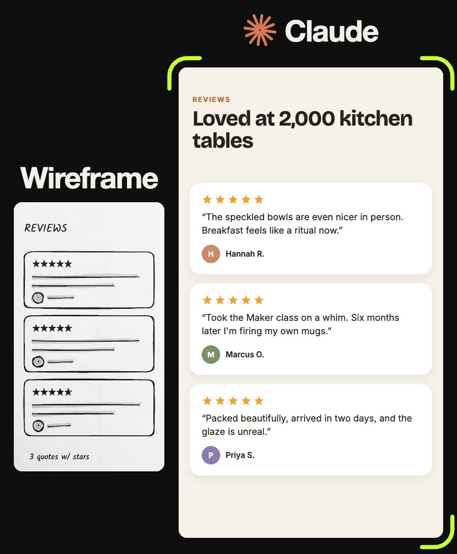
Reviews section: a small clay eyebrow "REVIEWS", headline "Loved at 2,000 kitchen tables", then three white rounded cards, each with five gold stars, a one-sentence quote and a coloured circle with the person's initial next to their name. Mark the quotes as placeholders for me to replace with real reviews.
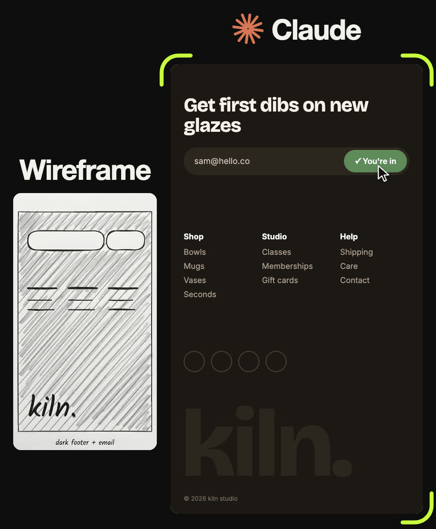
Dark footer #1d1814: headline "Get first dibs on new glazes", an email field with a clay Subscribe button inside the same pill that turns green and says "✓ You're in" when submitted, three link columns (Shop, Studio, Help), four round social icons, and a giant "kiln." wordmark at the bottom in a brown only slightly lighter than the background.
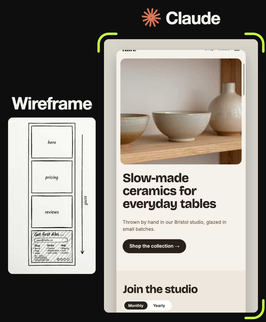
Stack hero, pricing, reviews and footer into one scrolling page with sections that fade and rise in as you scroll. Add a desktop layout above 960 px. Give me the single HTML file and tell me what to replace before publishing.
Tips
- Put prices, names and claims in your message. Claude will invent placeholders otherwise, and invented reviews must never go live.
- Build one section at a time. Fixing a hero is easy; fixing a hero inside a finished page means everything shifts.
- Shade the one thing you want people to notice on each section. Claude reads shading as emphasis, which is how the middle price tier became the dark one.
- Keep it one HTML file until it's right. You can always ask to split it into a proper project later.
- Test on your actual phone, not just a narrow browser window.
Claude skill
Do it in one go with the wireframe-to-website skill
Give Claude a photo of your wireframe and it reads the sections back, asks for the facts it can't see, then builds a working mobile-first page as one HTML file: design system first, section by section, then the full page with a desktop layout and accessibility checks. Includes the reel's measured spec and the finished kiln. page as a starter.
Download wireframe-to-website.zipIn Claude (web or desktop app)
- Open Settings → Capabilities and make sure code execution is on.
- Under Skills, choose Upload skill and pick the zip.
- Start a chat, attach a photo of your input, and ask for the result. Claude uses the skill on its own.
In Claude Code
- Unzip it into
~/.claude/skills/(or.claude/skills/in a project). - Restart Claude Code and ask for the result. The skill loads when it fits.