Resources · Guide 07 · MOOD
Turn three colour swatches into a full moodboard
Pick three colours and let Claude build the rest: a brand-world photo in those colours, the palette with hex codes, a font, a gradient and a name, laid out as one board. This is the process behind the reel's five boards.
What you'll make
- A 9:16 moodboard: brand-world photo, palette with hex codes, type specimen, gradient tile and name tile
- A brand-world photo made in your three colours
- A font and a one-word name that fit the mood
- The same layout for as many palettes as you want (the reel did five: warm, cold, neon, earthy, mono)
What you need
Claude
Reads your swatches, picks the font and name, writes the photo prompt and builds the board as a web page
Z Image Turbo
Makes the brand-world photo (we used it through the Higgsfield API; any strong image model works)
Google Fonts
Free fonts for the type specimen and name tile
Step by step
7 steps-
Pick three colours
Paint them, cut them from paper, or screenshot them. Write the hex code next to each one if you know it, and one word for the feeling, like "warm?" or "sunbaked vibe".
Aim for a dark, a mid and a light. The light one usually becomes the background. If you only have a photo, Claude can estimate the hex codes, but phone cameras shift colours, so check them with a colour picker.
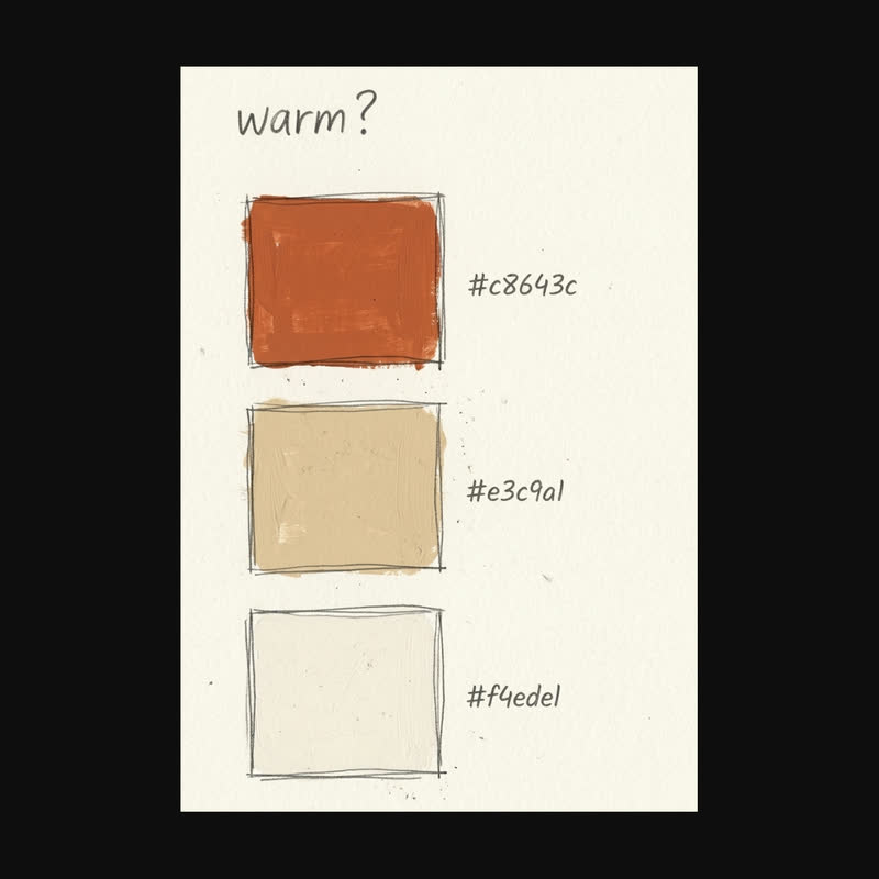 Warm
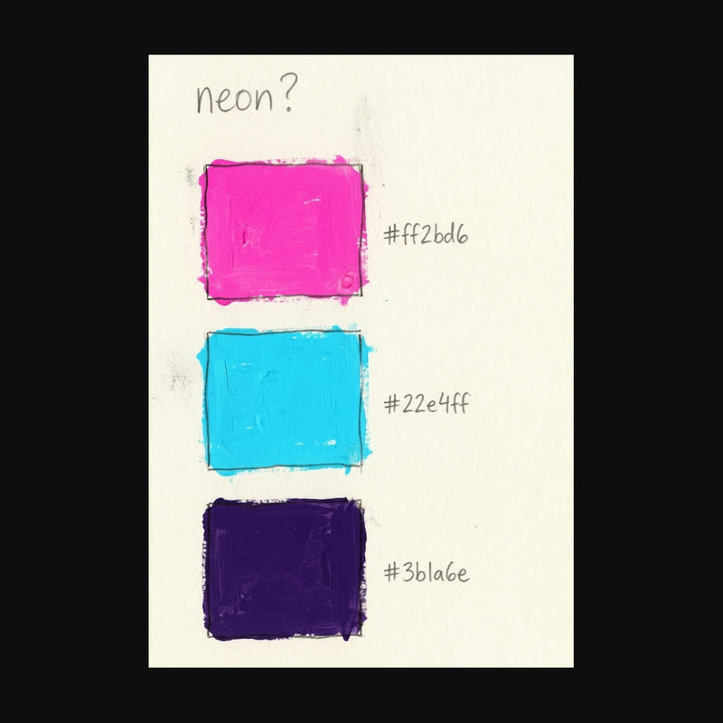 Neon
Two of the swatch sheets in the reel: a dark, a mid and a light colour, the hex code beside each and one word for the feeling. -
Ask Claude for the mood
Before any picture, settle the words: a mood, a one-word name for the board, a font, and plain names for your colours. The colour names matter because image models read "terracotta" far better than "#c8643c".
In the reel the warm board became "Sunbaked" in Fraunces, the cold one "Glacial" in Space Grotesk, and the neon one "Afterhours" in Unbounded.
Ask ClaudeHere are my three colour swatches. Give me: 1) the three hex codes in the order accent, secondary, background (say if you estimated any), 2) a plain name for each colour, 3) the mood in one word, 4) a one-word name for the moodboard, 5) one Google Font that fits, with its weight. Keep it short.
-
Have Claude write the photo prompt
The photo shows a little world in your colours: objects, materials and light, no people. Every prompt in the reel used the same pattern, so you can swap in any palette.
Ask for the prompt in that pattern, with three to five objects that naturally come in your colours.
Ask ClaudeWrite one image prompt for a brand-world photo in my palette, in this pattern: "Styled brand photography in a [mood] palette of [colour names]: [three to five objects and materials], [one kind of light], minimal still life". Use colour names, not hex codes. No people, text or logos.
-
Generate the photo
Run the prompt at 9:16 or 1:1. We used Z Image Turbo through the Higgsfield API (about $0.015 a picture), but Nano Banana, FLUX or Midjourney take the same prompt.
Make two or three and keep the one whose colours sit closest to your swatches. If one colour is missing, name an object that is usually that colour and run it again.
-
Have Claude build the board
Claude lays out the board as a web page you open in your browser, or as an artifact in claude.ai. The reel's layout is a big photo on top, then palette and type side by side, then a gradient and the name, with a small footer.
If you downloaded the skill, Claude starts from its moodboard template and only changes the colours, font, name and photo.
Ask ClaudeBuild my moodboard as one self-contained HTML page at 9:16 (573 x 1019 px). Layout: the photo across the top (529 x 470), then a palette tile with three equal chips showing the hex codes, next to a white tile with "Aa" in my font and the font name, then a gradient tile (135 degrees, accent to secondary, with a soft highlight of the background colour) next to a tile with the board name in my font. Rounded corners (18 px), soft shadows, 22 px margins, the background colour behind everything, and a footer reading "MOODBOARD · [NAME]". Load the font from Google Fonts. Let me drag my photo onto the photo tile. Make sure every label is readable on its colour.
-
Check it
Compare every hex code on the board with your swatches. Check the "Aa" tile shows your font and not a default serif, which means the font did not load.
Check the text is readable. In the reel, the earthy board's name came out walnut brown on olive and almost disappeared; ask Claude to switch to near-black or white wherever the contrast is low.
-
Make more moods
Repeat with new swatches, or ask Claude to propose four more palettes in the same layout. The reel's set was warm, cold, neon, earthy and mono. Neon needs a dark background so the colours glow; the reel used a near-black violet.
Take a screenshot of each board, or screen-record the page while the tiles pop in.
Ask ClaudeKeep this layout and give me four more boards: cold, neon, earthy and mono. For each, give three hex codes, a name, a font and a photo prompt in the same pattern. Neon gets a near-black background.
The prompts behind the reel
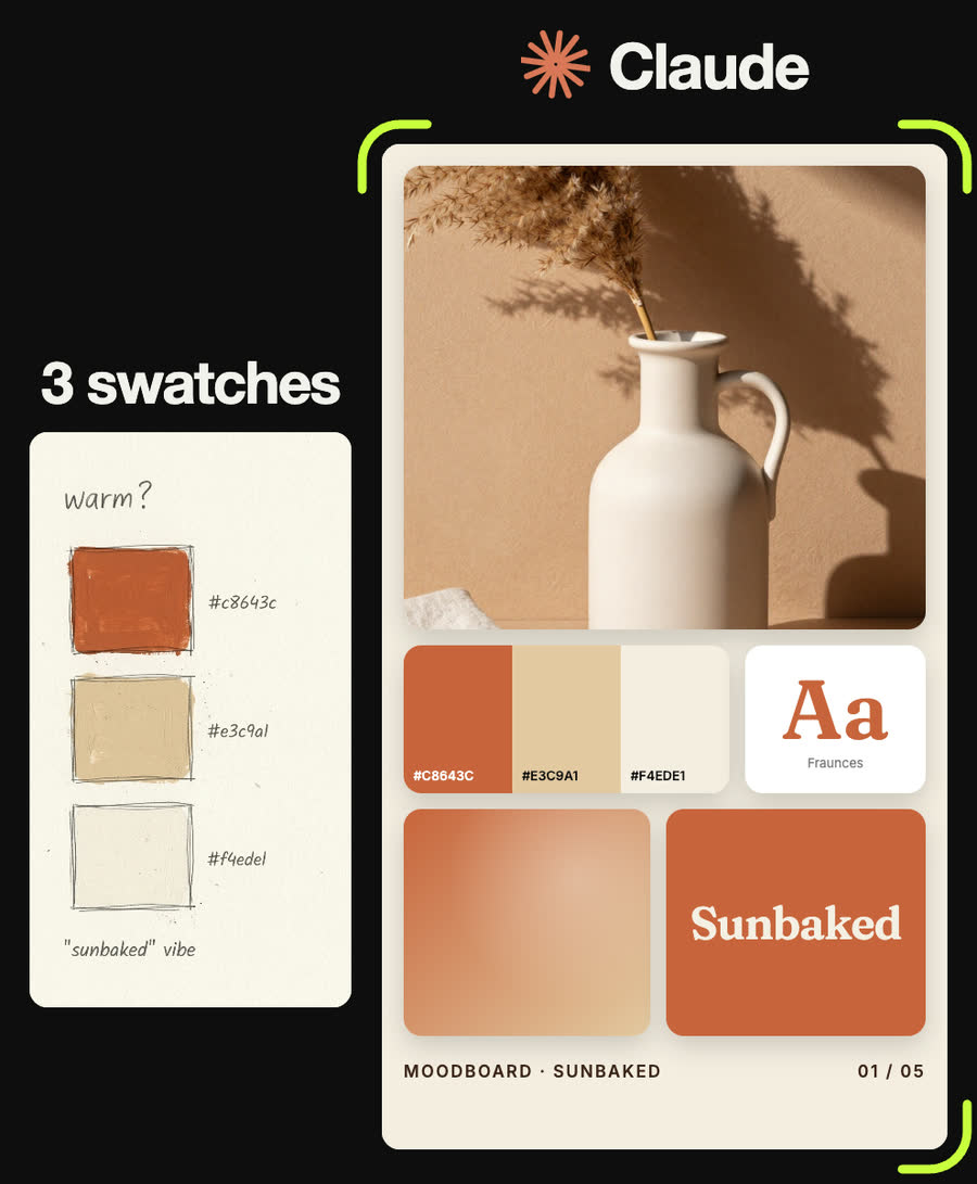
Styled brand photography in a warm palette of terracotta, sand and cream: a ceramic carafe, dried pampas grass, folded linen, hard sunlight shadows on a plaster wall, minimal still life
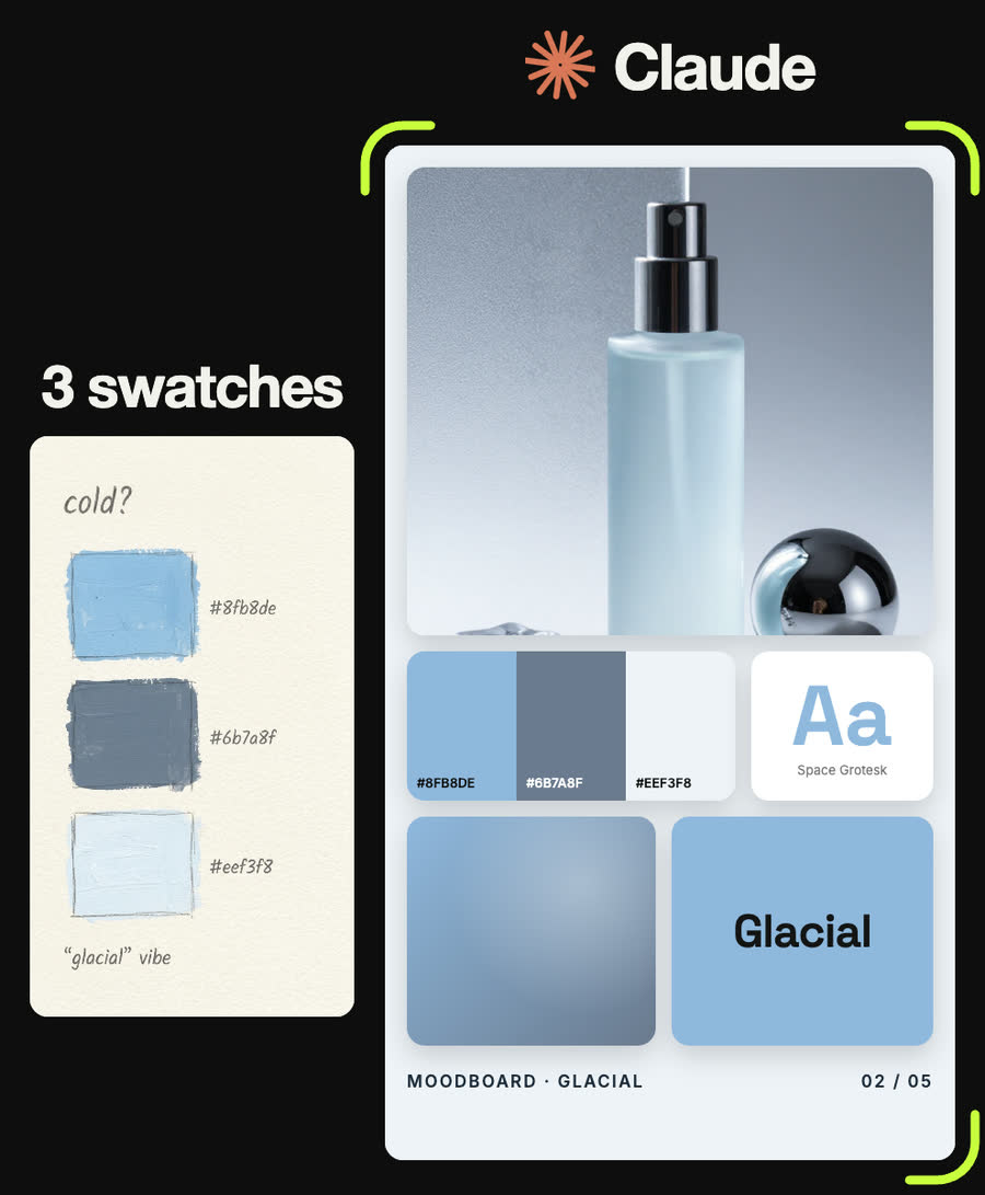
Styled brand photography in a cold palette of icy blue, steel grey and white: frosted glass, a chrome sphere, ice cubes, cool morning light, minimal still life
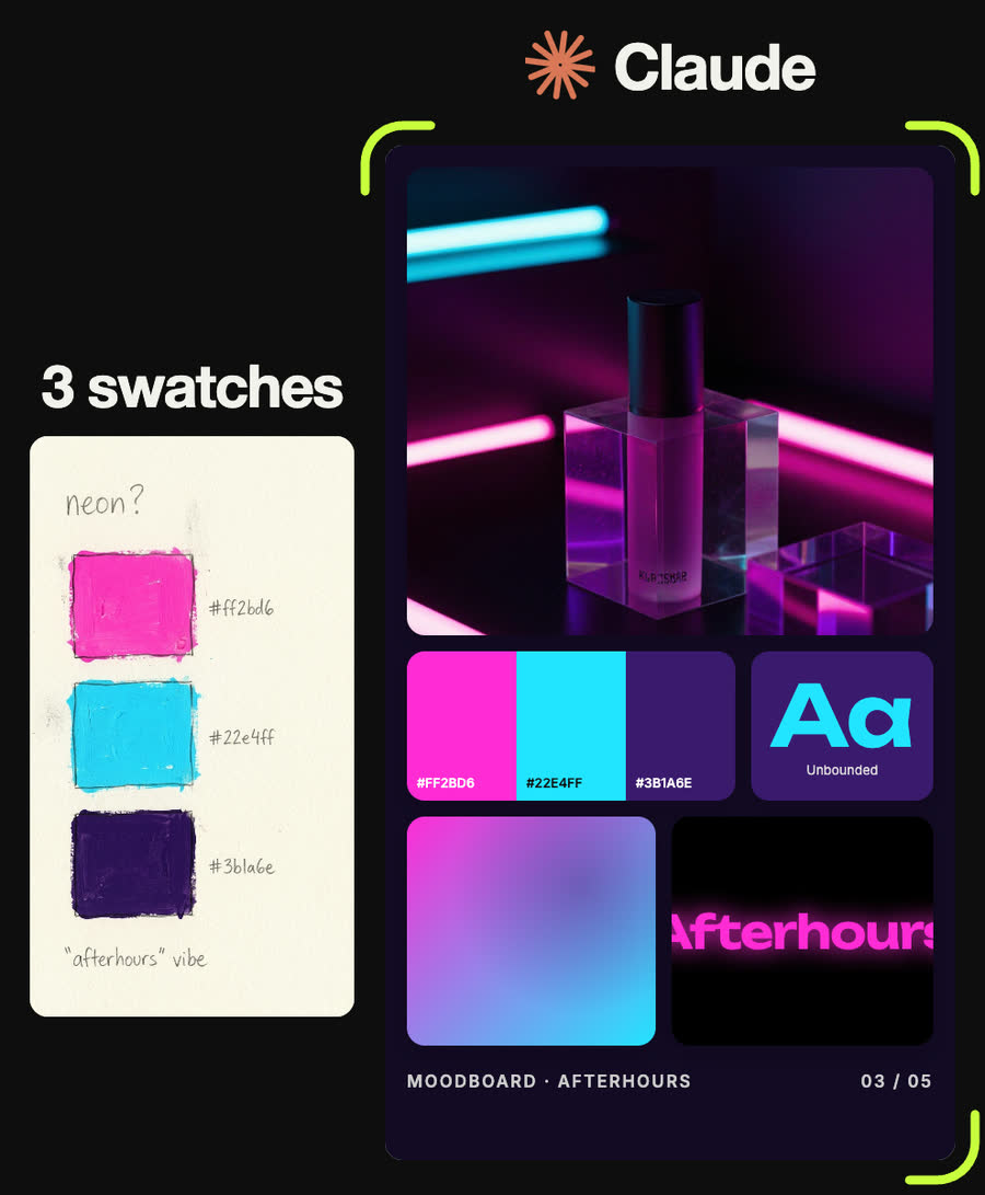
Styled brand photography in a neon palette of electric magenta, cyan and deep violet: neon tube light reflections on glossy black surfaces, a translucent acrylic cube, futuristic still life
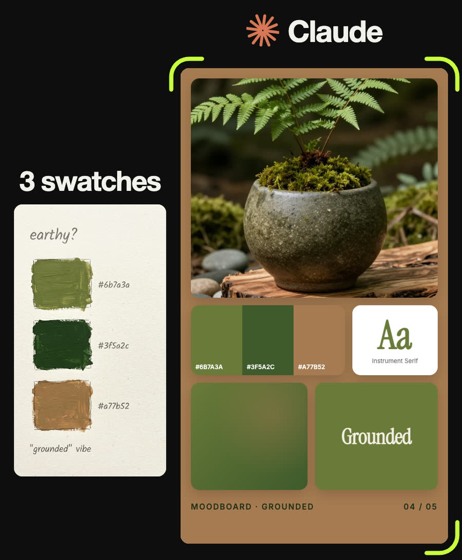
Styled brand photography in an earthy palette of olive green, moss and walnut brown: a stoneware pot with a fern, wood grain, smooth river stones, dappled forest light, natural still life
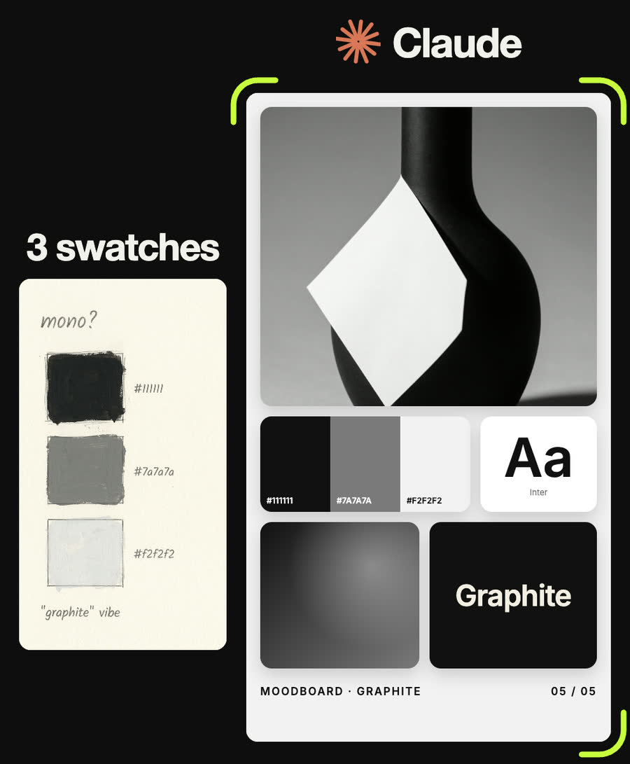
Black and white monochrome brand photography: a sculptural black vase, folded white paper, hard graphic shadows, high contrast minimal still life
Tips
- Put colour names in the photo prompt, not hex codes. Keep the hex codes for the board.
- Name objects that naturally come in your colours (terracotta pots, chrome, moss). The colour follows the object.
- Your lightest colour is usually the background. For neon or very saturated palettes, use a near-black instead.
- Check contrast on every label. A beautiful palette can still make an unreadable name tile.
- If a font looks like Times, it did not load. Ask Claude to add it to the Google Fonts link.
Claude skill
Do it in one go with the swatches-to-moodboard skill
Give Claude three colours and it returns the mood, a name, a font, a brand-world photo prompt and the finished board, built from the reel's own template. In Claude Code with a Higgsfield key it can also generate the photo for you.
Download swatches-to-moodboard.zipIn Claude (web or desktop app)
- Open Settings → Capabilities and make sure code execution is on.
- Under Skills, choose Upload skill and pick the zip.
- Start a chat, attach a photo of your input, and ask for the result. Claude uses the skill on its own.
In Claude Code
- Unzip it into
~/.claude/skills/(or.claude/skills/in a project). - Restart Claude Code and ask for the result. The skill loads when it fits.